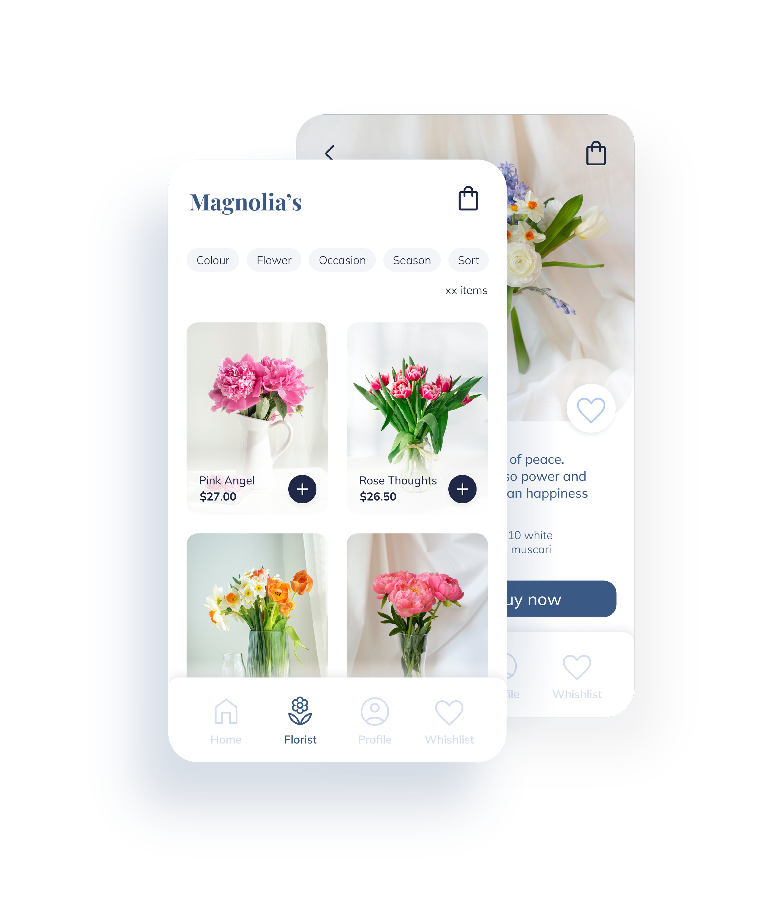
MAGNOLIA'S - BOUQUET PREVIEW APP
MAGNOLIA'S - BOUQUET PREVIEW APP
Magnolia’s is a trendy florist who wants to deliver beautiful fresh flower bouquets. They offer the chance to preview the bouquet and eventually customize it to your liking. Magnolia’s targets customers like busy workers or people who are not able to go personally to the shop.
Project overview
The problem
It all begins with an idea. Maybe you want to launch a business. Busy workers or people who are not able to go to the florist can’t personally buy flowers from the florist.
The goal
Design an app that allows users to preview, customize, and order fresh flower bouquets and have them delivered home.
My role
UX designer designing an app for the florist Magnolia’s, from conception to delivery.
Responsibilities
Conducting interviews, paper and digital wireframing, low and high-fidelity prototyping, conducting usability studies, accounting for accessibility, and iterating on designs.
User Research
I conducted interviews and created empathy maps to understand the users that I’m designing for and their needs. A primary user group identified through research was working adults who don’t have time to go to the florist, but still want some fresh flowers at home to help them feel more relaxed when they finish working. This user group confirmed initial assumptions about the florist Magnolia’s customers, the research revealed that time was the main factor limiting users from going to the florist to buy a fresh flower bouquet.
Time
Working adults are too busy to go personally to the florist.
Customization
Other apps to order flower bouquets usually don’t give the chance to customize the bouquet.
IA
Apps to order flower bouquets are usually not so intuitive to users who are not very good with technology.
THE PRODUCT
While designing the digital wireframes I made sure to make the user experience as much intuitive as possible.
In the Product screen, the user will find only the most useful info about the product itself. At the bottom, there is the price, and right next to it the “Buy now” button, so the user knows exactly how much it is required to pay.
Ideation Stage
WIREFRAME
Usability study
I conducted two rounds of usability studies. The first round helped me to improve the design from the wireframes to the mockups, while the second round was really helpful in guiding the improvements starting from the high-fidelity mockups.
Filters
The usability studies revealed that users would like more filters, one of the most suggested was «season». This filter allows users to see which flower bouquets are in season at a specific moment.
Customization
Early designs did not allow the users to customize the bouquet. I included this feature and also added an extra screen that allows the users to easily add or remove flowers from the bouquet.
Mockup


Accessibility considerations
Used icons to make navigation clear. The navigation is clean and simple to help users who are not very good with technology.
Used pictures to give the user a preview of the product they are going to order and detailed written information about it in the description beneath.
Provided access to users who are vision impaired through adding alt text to images for screen readers.
Next steps
Conduct another round of usability studies to see if the new design addresses all the previous pain points.
Conduct more user research to see if all the users needs have been
addressed.
Let’s connect!
Thanks for reviewing my work on the Magnolia’s app! If you’d like to see more or get in touch, visit my contact page.


