Mr. & Mrs.
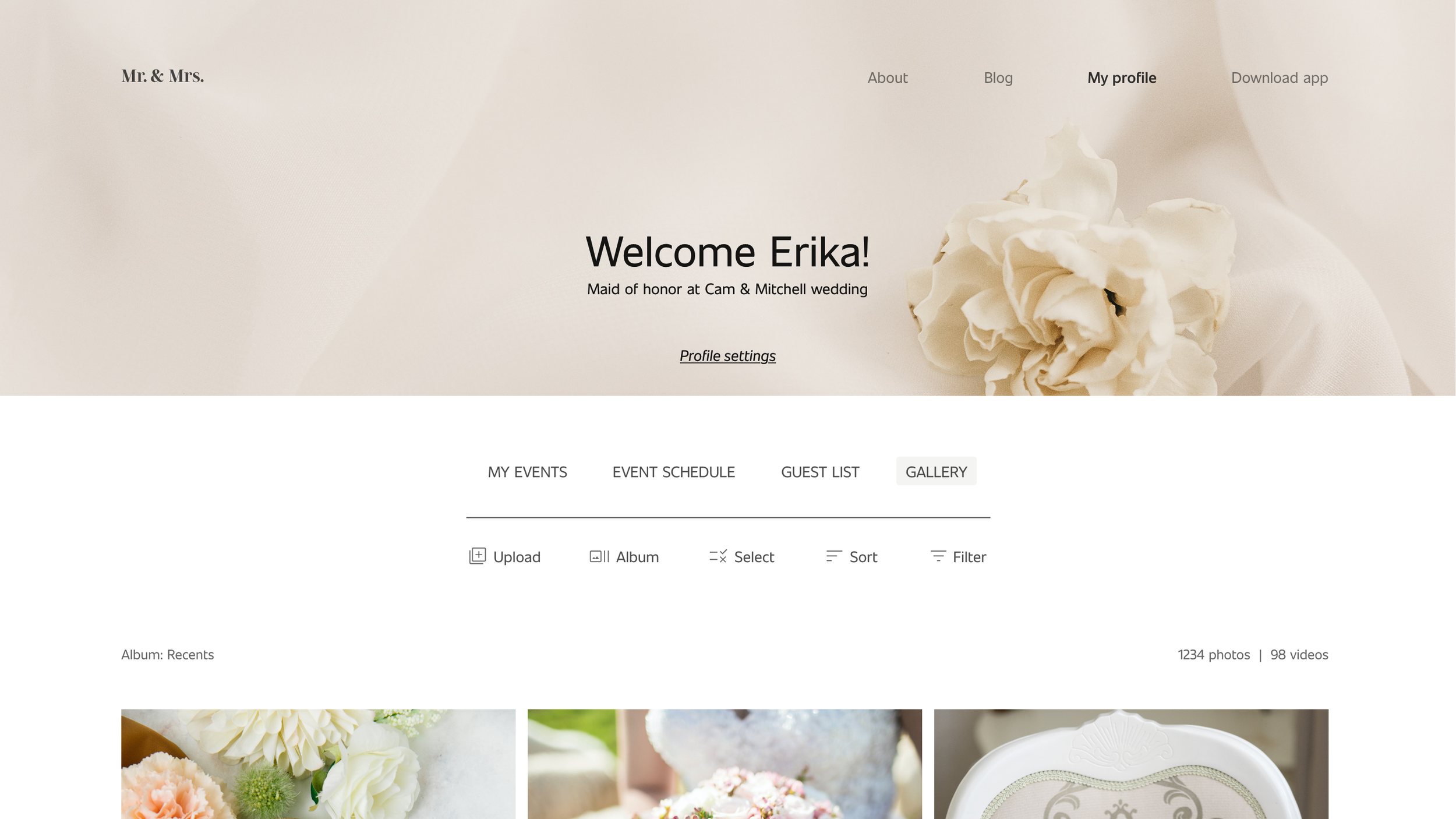
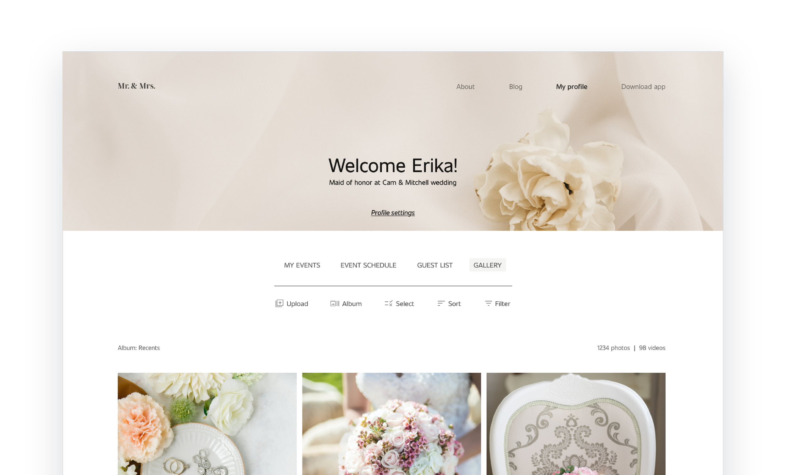
Mr. & Mrs. is a ceremony photo-sharing for a wedding venue. The goal is to help users to easily share the photos and videos of the event, therefore the final goal is to make this task easy for all types of users.
Project overview
-
Available online websites to share photos of the wedding venue are not easy to use and don’t allow users to share photos online but only through a downloaded app.
-
Design a website that allows users to share their photos online in a clear and easy way without having to download an app at all costs. The app is only an extension of the website.
-
The typical user is between 19-40 years old and most users are students or early career professionals.
-
UX Designer leading the Mr. & Mrs. website design.
-
Conducting interviews, paper and digital wireframing, low and high-fidelity prototyping, conducting usability studies, accounting for accessibility, iterating on designs, and responsive design.
User Research
I conducted user interviews, which I then turned into empathy maps to better understand the target user and their needs. I discovered that many target users don’t feel comfortable downloading an app to share the photos of the weddings they participate in and that they would rather share them online through a private account on a dedicated website. However, many websites dedicated to photo sharing of wedding venues ask the users to download the app to complete the task. Moreover, the navigation is not always easy and clear to the users.
Clear navigation
Many photo-sharing websites for wedding venues don’t have clear navigation.
Download the app
Photo-sharing websites usually ask users to download an app to complete the task of sharing a photo.
Features
Many photo-sharing websites don’t include all the features that the users really want to see in such websites (inviting new users, snapping and uploading a photo directly, and more).
The goal was to make the sitemap as more intuitive as possible. In the section My Profile the users can register or login and upload and download the content without having to download the app. It’s still possible to download the app, but not necessary to use the website.
Sitemap
Digital wireframes
For this project has been important to keep in mind the pain points to better address them and to focus on keeping the design simple and clear to avoid overloading the users with too much information.
Digital wireframe screen size variation
The wireframes for the mobile version have been kept as much clean as possible, just like the desktop version.
Usability study
Study type: unmoderated usability study
Location: Italy, remote
Number of participants: 5
Length: 20-30 minutes
-
On the My profile page the users didn’t understand what to do at first because the buttons where not clearly visible.
-
When uploading new photos and videos it was not clear how to annul the action.
-
At the beginning, it was not clear how to switch between events.
Mockup
Based on the insights from the usability study, I made changes to improve the upload flow. In the beginning, it wasn’t clear how to annul the upload, which was made simply by clicking out. Therefore I added an Annul button to the top right corner of the card.
Screen size variations
I included considerations for additional screen sizes in my mockups based on my earlier wireframes. Because users shop from a variety of devices, I felt it was important to optimize the browsing experience for a range of device sizes, such as mobile and tablet so users have the smoothest experience possible.


Accessibility considerations
I used headings with different-sized text for a clear visual hierarchy.
I used landmarks to help users navigate the site, including users who rely on assistive technologies.
I designed the site with alt text available on each page for smooth screen reader access.
Next steps
Conduct follow-up usability testing on the new website to see if the new design addresses all the previous pain points.
Conduct more user research to see if all the users’ needs have been
addressed.
Identify any additional areas of need and ideate on new features
Let’s connect!
Thanks for reviewing my work on the Mr. & Mrs. website! If you’d like to see more or get in touch, visit my contact page.


