Orange
Orange is an organization focused on food sustainability. The organization needs a tool that helps to share their food to avoid any waste. Orange’s primary target users include college students and adults who are concerned with the amount of food they waste and would like to share it to reduce waste.
Project overview
-
27% of food goes to waste per year in Italy. The strategy team at Orange has identified a willingness to share the food that is not going to be eaten before the expiration date to reduce the amount of food wasted.
-
Design a responsive website and an app that will help people share the food that can be saved from waste, and at the same time help people in need by saving as much food as possible.
-
UX designer leading the app and responsive website design from conception to delivery.
-
Conducting interviews, paper and digital wireframing, low and high-fidelity prototyping, conducting usability studies, accounting for accessibility, iterating on designs, determining information architecture, and responsive design.
User Research
I used Orange’s data on food waste to develop interview questions, which were then used to conduct user interviews. Most interview participants reported feeling badly about food waste, but they didn’t know what to do about it. The feedback received through research made it very clear that users would be open and willing to work towards eliminating food waste if they had access to an easy-to-use tool to help them share the food they wouldn’t be able to eat.
Too many buttons
People seem to find the app with too many buttons and would like to focus more on what they are dsharing.
Share more items
People can’t seem to understand that they can share more than one item at a time.
Separate items
People would like to see the list with the items they are gonna share with each item clearly separated from the others.
Wireframe


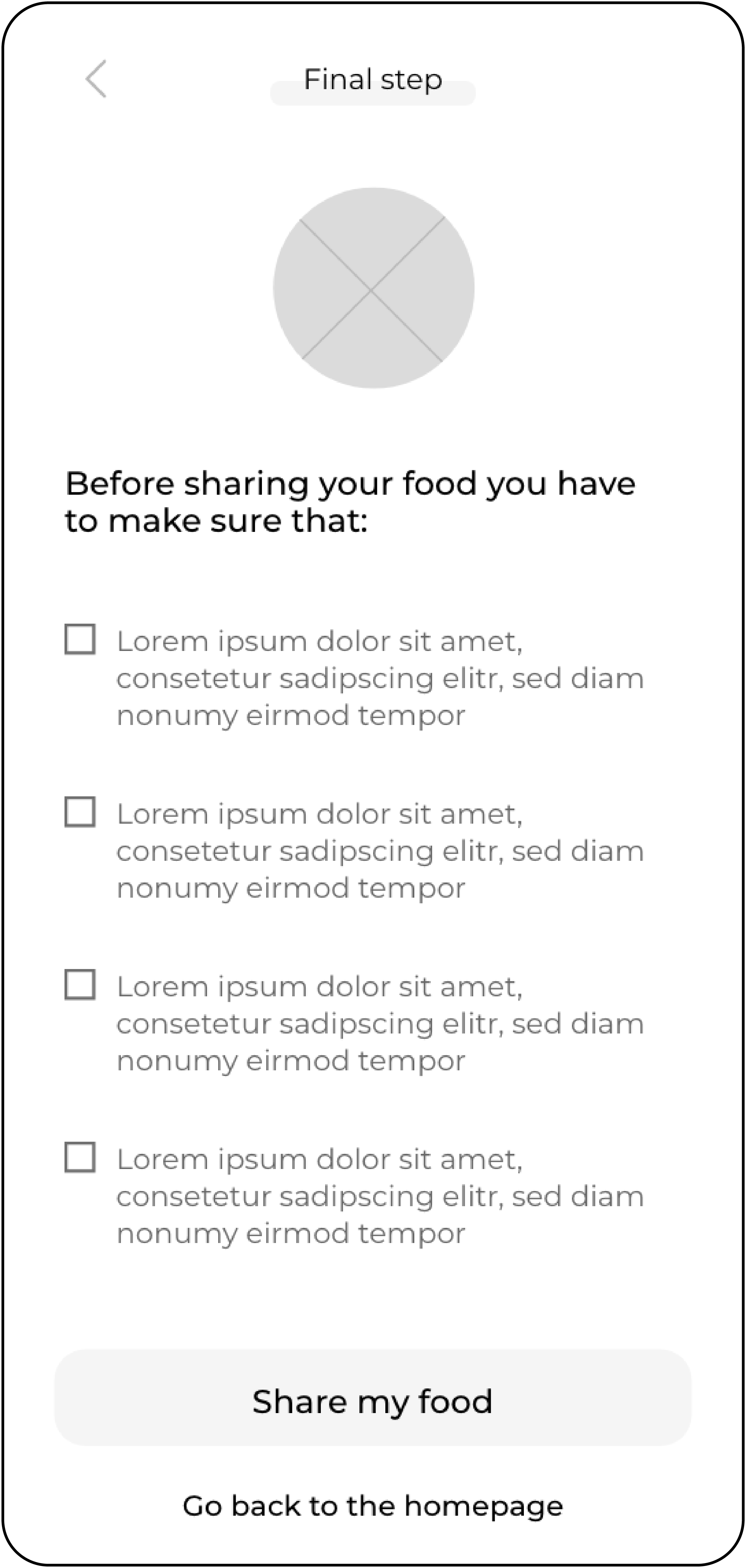

From wireframe to mockup
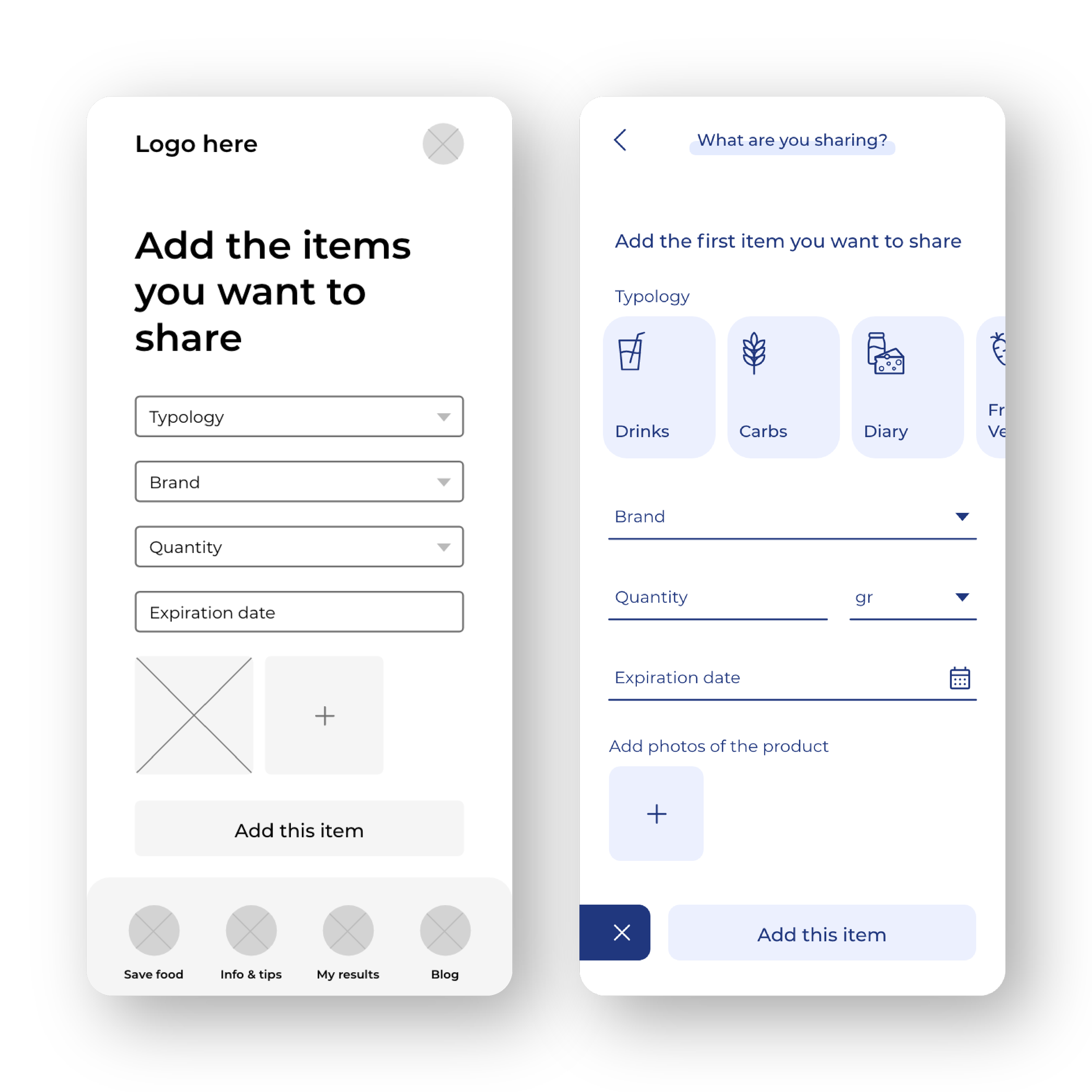
Adding food items
Based on the insights from the usability studies, I applied design changes like removing the bottom navigation, to allow users to focus on the items they are sharing.
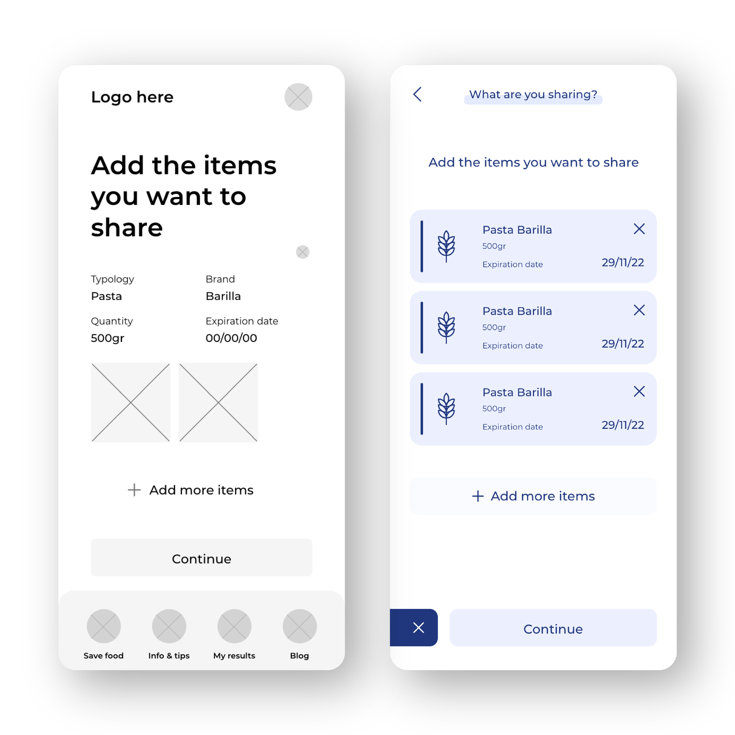
Food items list
Additional design changes included separating the elements in the list of food items the user is sharing.
Accessibility considerations
Clear labels for interactive elements that can be read by screen readers.
The initial focus of the home screen on personalized recommendations helps define the primary task or action for the user.
Mockup


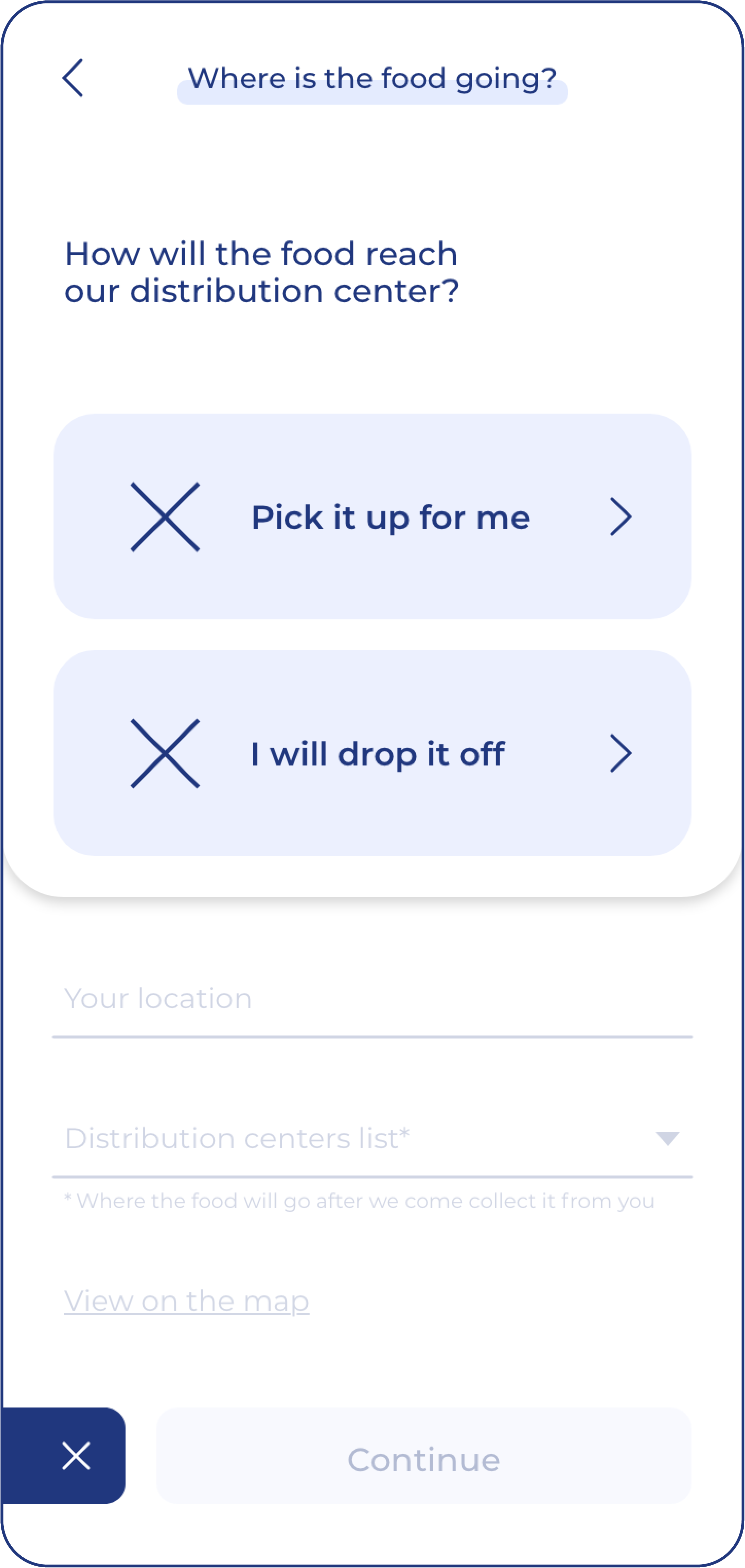

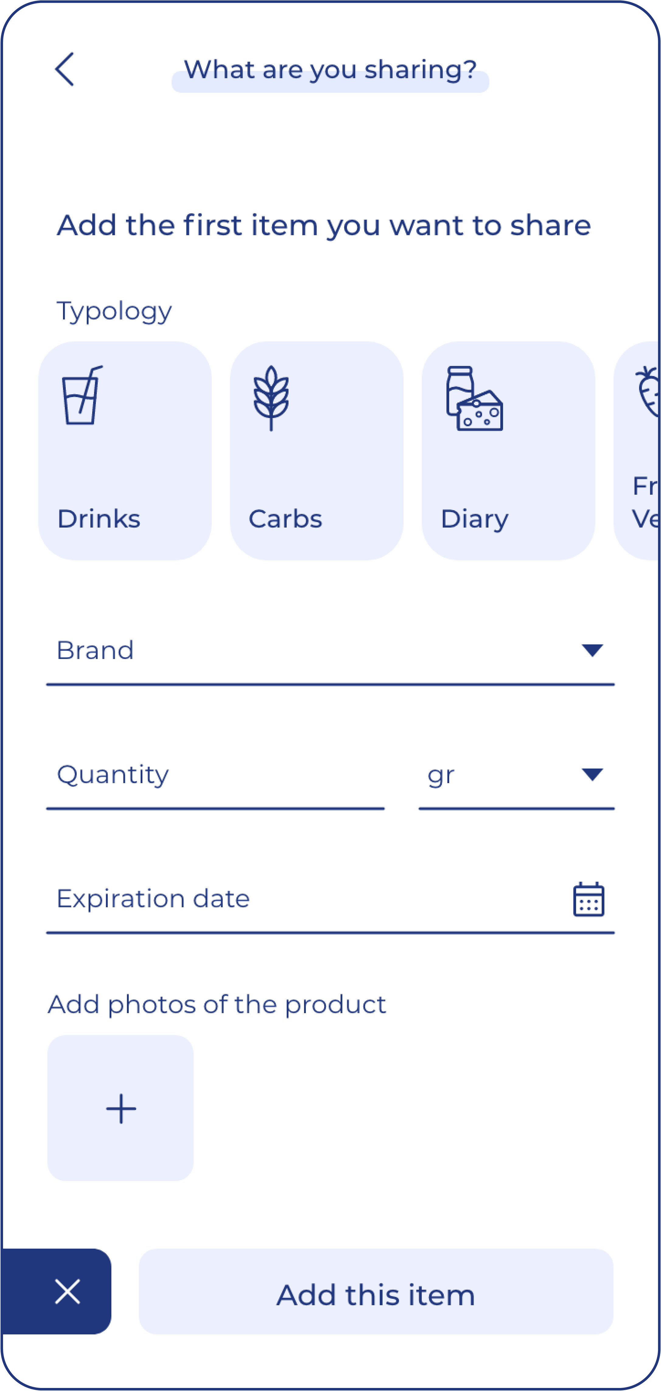


Sitemap
With the app designs completed, I started to work on designing the responsive website. I used the Orange sitemap to guide the organizational structure of each screen’s design to ensure a cohesive and consistent experience across devices.
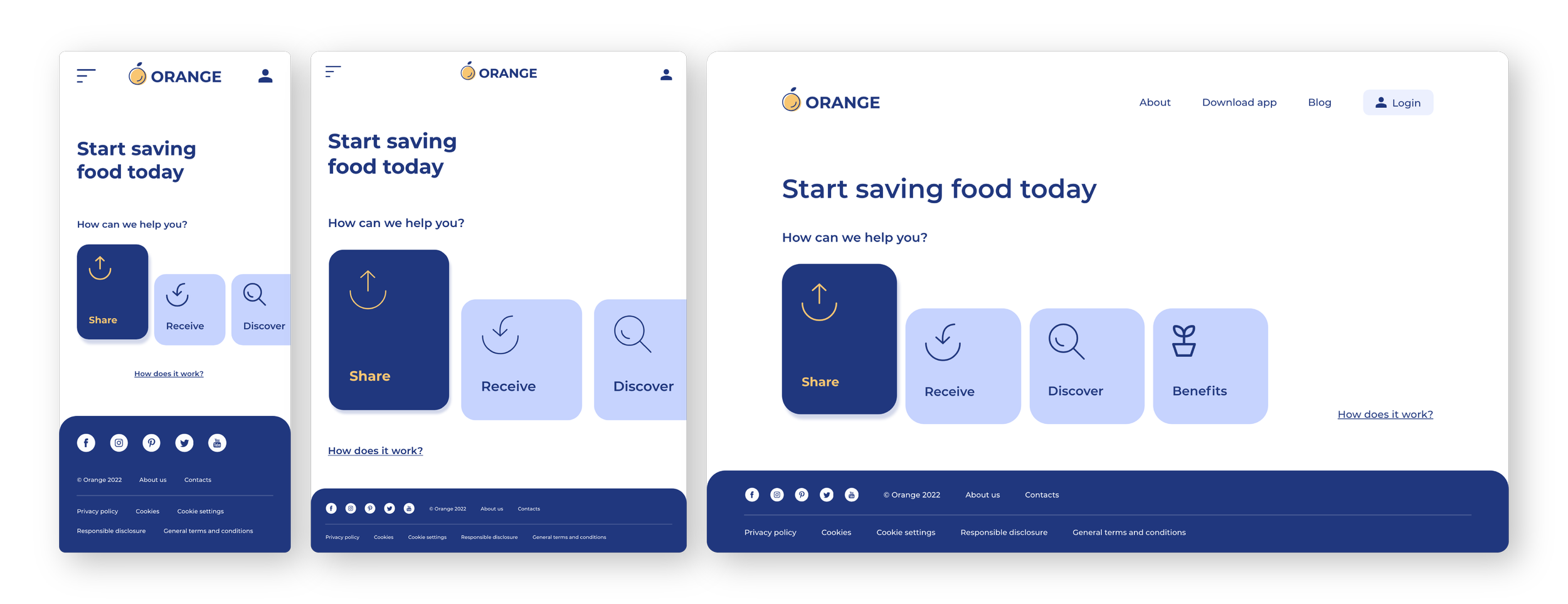
Responsive design
The designs for screen size variation included mobile, tablet, and desktop. I optimized the designs to fit the specific user needs of each device and screen size.
Next steps
Conduct research on how successful the app is in reaching the goal of reducing food waste.
Add the chance for users to specify any allergies, intolerances, or diets.
Provide incentives and rewards to users for successfully reducing
their food waste.
Impact
Users shared that the app made food waste seem like something they could actually help reduce. One quote from peer feedback was that “the Orange app helps give a second life to the food items that are not going to be eaten by their first owners.”
Let’s connect!
Thanks for reviewing my work on Orange app! If you’d like to see more or get in touch, visit my contact page.


